The USDA will republish climate change information online following farmer lawsuit

In the early days of President Donald Trump‘s second administration, federal agencies including the US Department of Agriculture were ordered to remove information about climate change from their websites. Now, the USDA has committed to reinstating the deleted content following a lawsuit on behalf of the Northeast Organic Farming Association of New York, the National Resources Defense Council and the Environmental Working Group. According to a letter sent yesterday to a district court judge, the agency has already begun the restoration process and expects to “substantially complete” the effort in about two weeks.

The material removed from USDA sites in February included content about climate-smart agriculture, forest conservation, climate change adaptation and clean energy project investments in rural areas. The trio of plaintiffs sued on the basis that removing that information violated the Freedom of Information Act that allows public access to important federal records, as well as failing to provide advanced notice required by the Paperwork Reduction Act and without the reasoned decision-making of the Administrative Procedure act. The USDA said that it “will restore the climate-change-related web content that was removed post-Inauguration, including all USDA webpages and interactive tools enumerated in plaintiffs’ complaint.” 

“This is a major victory and an important first step. Members of the public, including our clients, rely on information from USDA to understand how climate change is affecting our nation’s forests, food supply, and energy systems,” said Stephanie Krent, staff attorney with Knight First Amendment Institute, which helped file the lawsuit. “USDA was wrong to remove these webpages in the first place, and it must comply with federal law going forward.”

This article originally appeared on Engadget at https://www.engadget.com/science/the-usda-will-republish-climate-change-information-online-following-farmer-lawsuit-211907357.html?src=rss

“Google wanted that”: Nextcloud decries Android permissions as “gatekeeping”

Nextcloud is a host-your-own cloud platform that wants to help you “Regain control over your data.” It contains products that allow for video chat, file storage, collaborative editing, and other stuff that reads a lot like a DIY Google Workspace replacement.

It’s hard to offer that kind of full replacement, though, if your Android app can’t upload anything other than media files. Since mid-2024, Nextcloud claims, Google has refused to reinstate the access it needs for uploading and syncing other file types.

“To make it crystal clear: All of you as users have a worse Nextcloud Files client because Google wanted that,” reads a Nextcloud blog post from May 13, attributed to its team. “We understand and share your frustration,” but there is nothing we can do.”

Read full article

Comments

How (and Why) to Connect Your Apple Watch to Your Peloton

I am someone who is borderline obsessed with monitoring my health and fitness data. I use a smart scale, a calorie- and nutrient-tracking app, smart workout equipment, and my beloved Apple Watch to create a picture of my overall physical well-being that is as complete as possible. The only time I take my Apple Watch off is when I’m dressing up to go somewhere nice and even then, it pains me deeply. Just imagine the heart rate and calorie-burning data I’m missing out on while I waltz around in my fancy dress. It’s sickening.

All of these apps and devices work in concert to keep tabs on my every heartbeat and footstep, but there is a notable exception. I am usually against linking my Apple Watch to apps that track my workouts, as this has caused headaches in the past by double-importing data into my food-tracking app and daily Apple Health summary—this defeats the purpose of the monitoring altogether by significantly inflating my burned calories and total active minutes. Today, reluctantly, I linked my Apple Watch to my Peloton Bike, expecting it to cause the same problems—but it only impressed me. Now, I’m a believer in linking these two devices. I’ll tell you why, plus how to do it.

How to link your Apple Watch and Peloton device

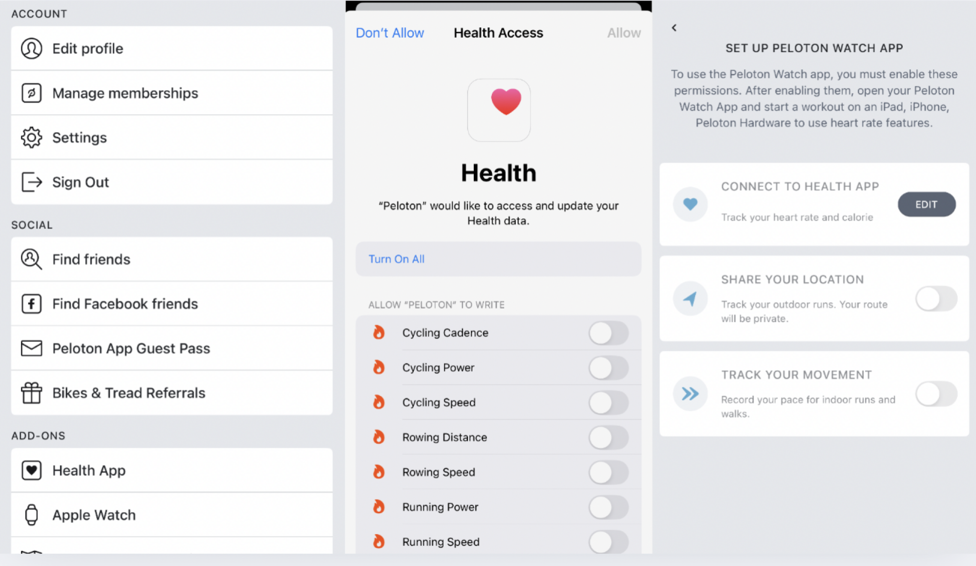
On your Peloton app, select your Profile (on the right of the menu at the bottom of the home screen), then find the hamburger menu on the top right of your profile screen. Selecting that will bring you to a page called More and right there, under Add-Ons, you’ll find Apple Watch.

Setting up Apple Watch in Peloton iOS app

Credit: Lindsey Ellefson

Tap that, grant the permissions in Apple Health when prompted, hit Set up, and you’ll see three choices: Connect to Health App, Share Your Location, and Track Your Movement. For our purposes, with the Bike and other at-home workout equipment, you’ll just toggle on that first one, but if you want your outdoor runs tracked privately, toggle on the second one, and if you want your pace for indoor runs and walks recorded, hit the third one, too.

From there, I just opened the Watch app on my phone to double-check that the Peloton app was included in the apps installed on the device. I scrolled to the bottom of the Watch app, selected Peloton from the list under Installed on Apple Watch, and toggled on Show App on Apple Watch.

Why I enjoy the link between the Apple Watch and Peloton

After that, I hopped on my stationary bike and started up a workout. I opened up the Workout app on my watch and selected “indoor cycle,” then opened the Peloton app on the watch. It showed me a blank screen with just a few words telling me to start a workout on the bike, so I did. Suddenly, the watch screen changed and began showing my heart rate. More interestingly, a small heart-rate tracker appeared on the upper left on my Peloton touch screen along with a power bar showing what “zone” I was in based on my heart rate. (My Peloton “power zones” are customized to my fitness level because I took the FTP test offered through the bike, which you should also do.)

There’s already plenty of information available on the screen, like cadence, resistance, and output, but I didn’t find this distracting. It was actually pretty helpful to get a sense of what “zone” I was in. I only selected a 10-minute workout, so I didn’t expect to be wiped out, but it was nice to gauge how much I was pushing myself so I could work to get the most out of those 10 minutes. When the class was over, I opened the Lanebreak app on the bike. Lanebreak is a virtual game offered by Peloton that I absolutely love and play every day, so I was interested in seeing if the heart rate monitor would pop up on the screen during a level, too. It did!

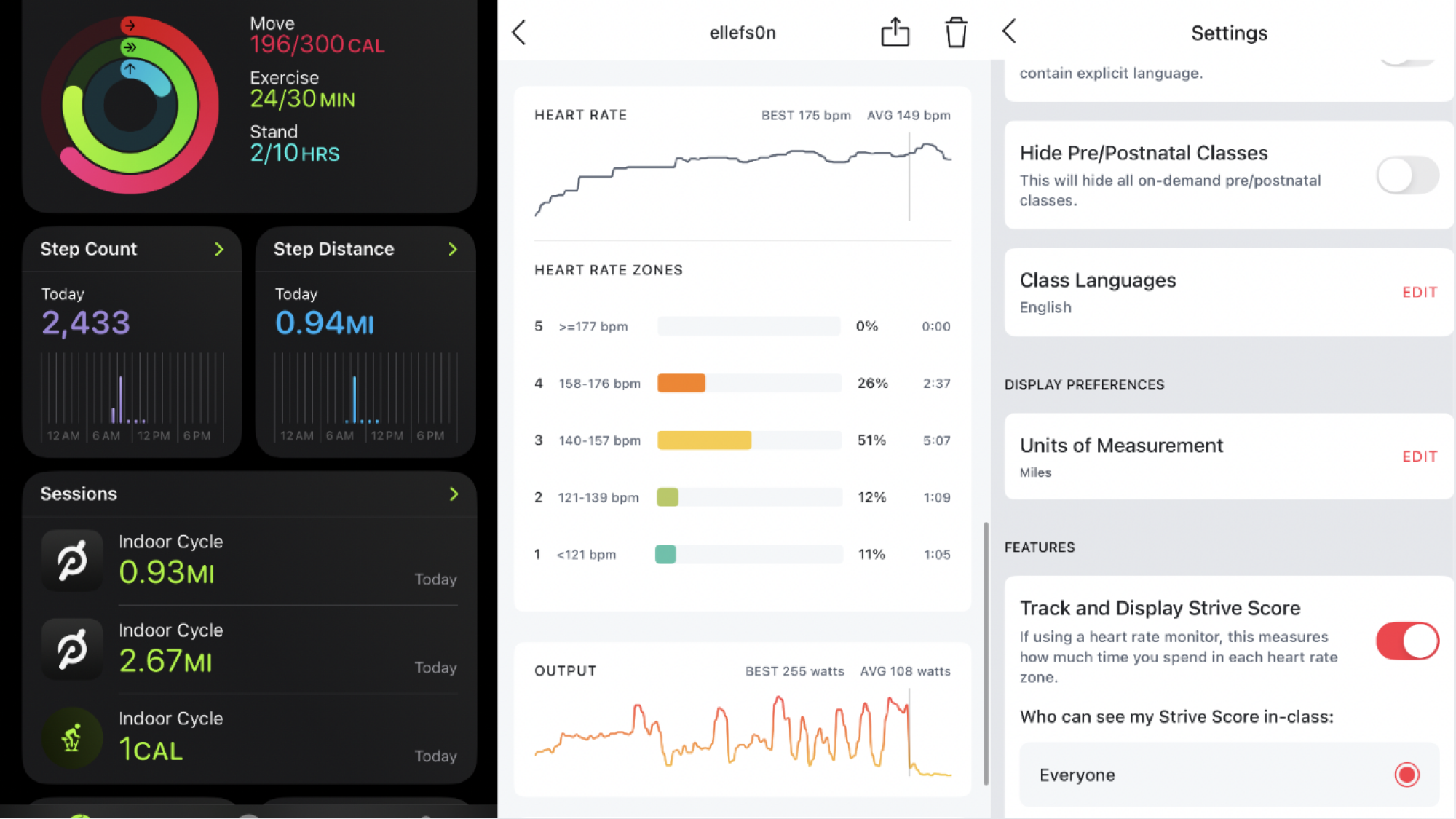
After my five-minute cooldown Lanebreak level ended, I opened the Workout app on the watch again to mark down that I was done, like I always do. To my surprise, the Peloton app actually overrode it; the Workout app had stopped tracking my indoor cycle session as soon as the Peloton app took over. That made me nervous because I was afraid that the workout wouldn’t be reflected in my Apple Health daily summary or Activity Rings, but when I opened that up on my phone, there they were: Two “indoor cycle” workouts under Sessions. Where they’d normally have the green Apple Workout logo next to them, they had the Peloton logo. They were tracked and categorized just like an indoor cycle session I would normally monitor using my watch. They counted toward the Move and Exercise portions of my Activity Rings and all.

I opened my nutrition-tracking app to make sure the burned calories hadn’t been double-entered. They hadn’t! The Peloton App succeeds where other apps have failed: It doesn’t make tracking your movement across various apps and devices a convoluted mess.

Finally, I opened the Peloton app to look at the summary of my workouts. They usually include estimates of your burned calories and output, plus which muscles you worked and how long you were at it, but now, they included more detailed breakdowns of how long I spent in each heart rate zone and provided more information on my total output.

What is the benefit of linking these devices?

Like I said, the Peloton app tracked the same things my Apple Watch would track on its own using the Workout function: My heart rate, my burned calories, and the duration of my workout. So, you might wonder, what’s the point of linking the bike (or Peloton Tread or Row) to the watch at all?

There are a few benefits that are evident here. First, it was convenient to see my heart rate and power zone reflected on the Peloton screen. I didn’t have to glance down at my wrist to see my heart rate like I usually do; I could stay focused on the screen, which is important for safety, and pace myself in real time to make sure I stayed in the zone I wanted to be in.

Second, linking the Apple Watch and Peloton device enables you to see something called you “strive score.” This is a personal metric that helps you understand and visualize how hard you worked during a class or ride, and it’s based on a combination of your heart rate and how long you spent in each of Peloton’s seven “power zones.” (Lower zones correspond with a lower heart rate and higher zones correspond with a higher one.)

Peloton Apple Watch data in iOS

Credit: Lindsey Ellefson

Be warned: You have to toggle on the strive score separately, which I didn’t know at first, so my 10-minute ride doesn’t have one, but my Lanebreak level does. Doing this is simple: From that same More menu in your profile, hit Settings and scroll all the way to the bottom. Toggle on Track and Display Strive Score and then choose whether in-class participants can see it or not. I was annoyed that the only strive score I got for the day was a measly 2.2 on my five-minute cooldown, but that only inspires me to, well, strive for a higher one tomorrow.

Overall, there is no downside to linking your Apple Watch and Peloton device, which isn’t always true when it comes to other fitness apps. In fact, you can get even more comprehensive workout data by doing it and I, for one, think it’s awesome.

Microsoft shares its process (and discarded ideas) for redone Windows 11 Start menu

Microsoft put a lot of focus on Windows 11’s design when it released the operating system in 2021, making a clean break with the design language of Windows 10 (which had, itself, simply tweaked and adapted Windows 8’s design language from 2012). Since then, Microsoft has continued to modify the software’s design in bits and pieces, both for individual apps and for foundational UI elements like the Taskbar, system tray, and Windows Explorer.

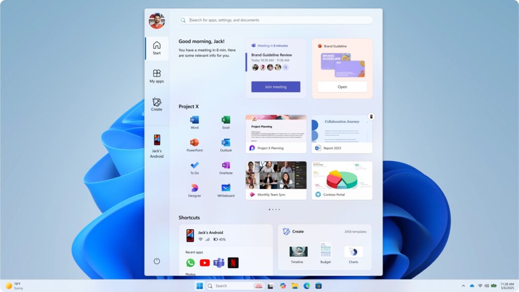
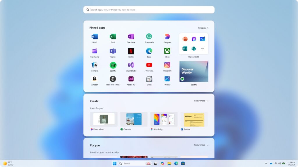
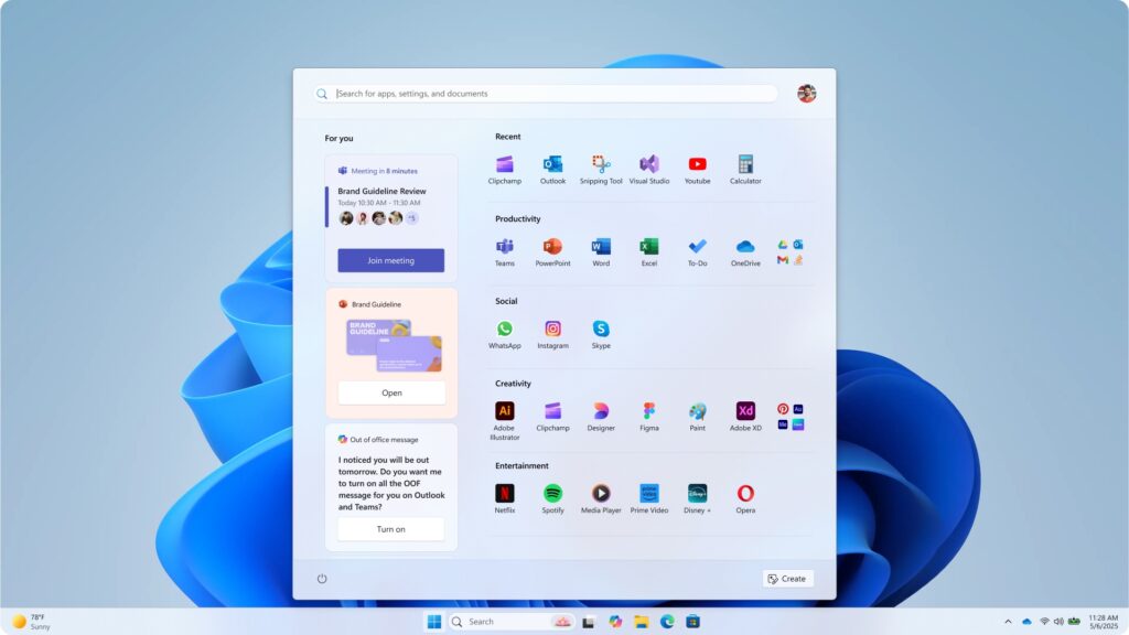
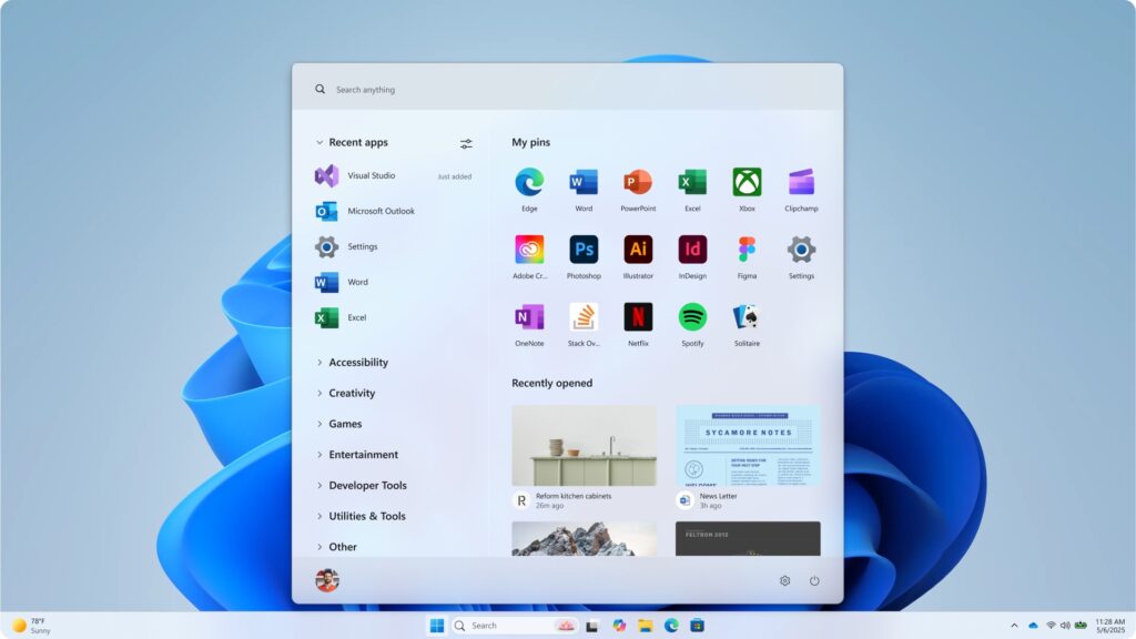
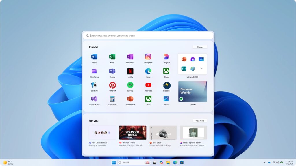
Microsoft is currently testing a redesigned version of the Windows 11 Start menu, one that reuses most of the familiar elements from the current design but reorganizes them and gives users a few additional customization options. On its Microsoft Design blog today, the company walked through the new design and showed some of the ideas that were tried and discarded in the process.

This discarded Start menu design toyed with an almost Windows XP-ish left-hand sidebar, among other elements.


Credit:

Microsoft

Some designs brings to mind the full-screen Start experience of Windows 8.


Credit:

Microsoft

Another big design with acres of icons and more space dedicated to non-app-icons.


Credit:

Microsoft

This design included thumbnail previews for recently opened files.


Credit:

Microsoft

Another discarded Start menu design.


Credit:

Microsoft

Microsoft says it tested its menu designs with “over 300 Windows 11 fans” in unmoderated studies, “and dozens more” in “live co-creation calls.” These testers’ behavior and reactions informed what Microsoft kept and what it discarded.

Read full article

Comments

NASA Webb Reveals Breathtaking Detail And Mysterious Activity In Jupiter’s Auroras

NASA Webb Reveals Breathtaking Detail And Mysterious Activity In Jupiter's Auroras
As a planet that’s over 1,300 times larger than the Earth, Jupiter was dubbed King of the Planets for a reason. Recurring extraordinary phenomena in its atmosphere are also testimonies that it is truly the largest planet in our solar system. Scientists have reported that data captured by NASA’s JWST reveals stunning details about Jupiter’s

Republicans Try To Cram Decade-Long AI Regulation Ban Into Budget Reconciliation Bill

An anonymous reader quotes a report from 404 Media: Late last night, House Republicans introduced new language to the Budget Reconciliation bill that will immiserate the lives of millions of Americans by cutting their access to Medicaid, and making life much more difficult for millions more by making them pay higher fees when they seek medical care. While a lot of attention will be justifiably given to these cuts, the bill has also crammed in new language that attempts to entirely stop states from enacting any regulation against artificial intelligence.

“…no State or political subdivision thereof may enforce any law or regulation regulating artificial intelligence models, artificial intelligence systems, or automated decision systems during the 10 year period beginning on the date of the enactment of this Act,” says the text of the bill introduced Sunday night by Congressman Brett Guthrie of Kentucky, Chairman of the House Committee on Energy and Commerce. The text of the bill will be considered by the House at the budget reconciliation markup on May 13.

That language of the bill, how it goes on to define AI and other “automated systems,” and what it considers “regulation,” is broad enough to cover relatively new generative AI tools and technology that has existed for much longer. In theory, that language will make it impossible to enforce many existing and proposed state laws that aim to protect people from and inform them about AI systems. […] In theory none of these states will be able to enforce these laws if Republicans manage to pass the Budget Reconciliation bill with this current language.


Read more of this story at Slashdot.

Google introduces Advanced Protection mode for its most at-risk Android users

Google is adding a new security setting to Android to provide an extra layer of resistance against attacks that infect devices, tap calls traveling through insecure carrier networks, and deliver scams through messaging services.

On Tuesday, the company unveiled the Advanced Protection mode, most of which will be rolled out in the upcoming release of Android 16. The setting comes as mercenary malware sold by NSO Group and a cottage industry of other exploit sellers continues to thrive. These players provide attacks-as-a-service through end-to-end platforms that exploit zero-day vulnerabilities on targeted devices, infect them with advanced spyware, and then capture contacts, message histories, locations, and other sensitive information. Over the past decade, phones running fully updated versions of Android and iOS have routinely been hacked through these services.

A core suite of enhanced security features

Advanced Protection is Google’s latest answer to this type of attack. By flipping a single button in device settings, users can enable a host of protections that can thwart some of the most common techniques used in sophisticated hacks. In some cases, the protections hamper performance and capabilities of the device, so Google is recommending the new mode mainly for journalists, elected officials, and other groups who are most often targeted or have the most to lose when infected.

Read full article

Comments

How to Make Your First ‘Ninja Slushi’ (Without Ruining It)

We may earn a commission from links on this page.

Unboxing a new kitchen appliance is one of my favorite experiences—it’s a non-holiday present and I know what’s inside—how wonderful! But the instruction manual part really kills my vibe. I know tossing it aside will almost surely lead to failure, but I hate reading them anyway.

In fact, I did read the operation manual for the Ninja Slushi, and I still managed to screw up my first batch of slush. (You can read about that experience in my review of the Ninja Slushi.) To help you avoid the shame of a ruined slush, not to mention reading the tedious instructions, I’ve assembled this step by step guide on operating your new Ninja Slushi, from set-up to clean-up.

Notes on sugar and alcohol

Before getting started, know that what you put into the machine will directly affect your success. Specifically, the liquid you’re using must have at least 4% sugar content. If it doesn’t, it will become too icy, and the machine will have trouble scraping the frozen mixture out of the evaporator cylinder. (You can’t use artificial sweeteners or sugar substitutes either, unless you want to fall down a rabbit hole of allulose and xanthan gum and brightly hued, sugar-free prepackaged slushie mixes.)

Ninja provides a little chart indicating the minimum amount of sugar you need for a particular serving size. Make a simple syrup by mixing the amount of sugar with an equal amount of water and microwaving it until warm. Stir the mixture until the sugar dissolves. This simple syrup can be added to your greater recipe mixture before pouring it into the Ninja Slushi (make sure to account for the water from your simple syrup in your overall calculations).  

Even if you messed up and froze a cold brew mixture without any sugar by accident, you can fix it. (Maybe I know this first hand? Maybe I don’t.) The machine will stop if it detects a problem with your sugar content during the churning process. This is your chance to make a simple syrup with the correct amount of sugar and pour it in to the mix. Don’t add sugar directly to the chamber mid-freeze—it may have trouble dissolving into the partially frozen drink.

Alcohol has a similar stipulation—a minimum of 2.8% and a maximum of 16% alcohol must be present to make a spiked slush that will freeze properly. Again, there’s a helpful chart to guide you on your journey, but once you know these rules and abide by them, the machine will play nice.

Now, let’s make that slush.

1. Set up the Ninja Slushi

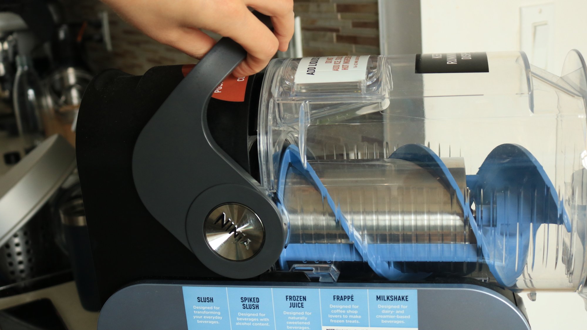
A person pulling the handle to secure the container on the Ninja Slushi.

Credit: Allie Chanthorn Reinmann

Like dishware, bakeware, and anything else from a dusty factory, it’s a good idea to take apart the Slushi and clean the parts with soapy water before you put food in it. That includes the drip tray, the main vessel, the condensation catch, and the auger (that spiral thingy). The silver evaporator is not removable, so just wipe it down with a soft cloth. Dry everything thoroughly.

It’s no small appliance, so make sure you clear off a nice section of your countertop. There are vents on the sides and back, so give those areas room to breathe too. Put the parts back in their respective areas. The main vessel sits into the bail handle in the back, as you pull it backward. It won’t make a clicking sound, but it will sit there securely secure. Once reassembled, plug in the machine.

2. Pour in the liquid mixture

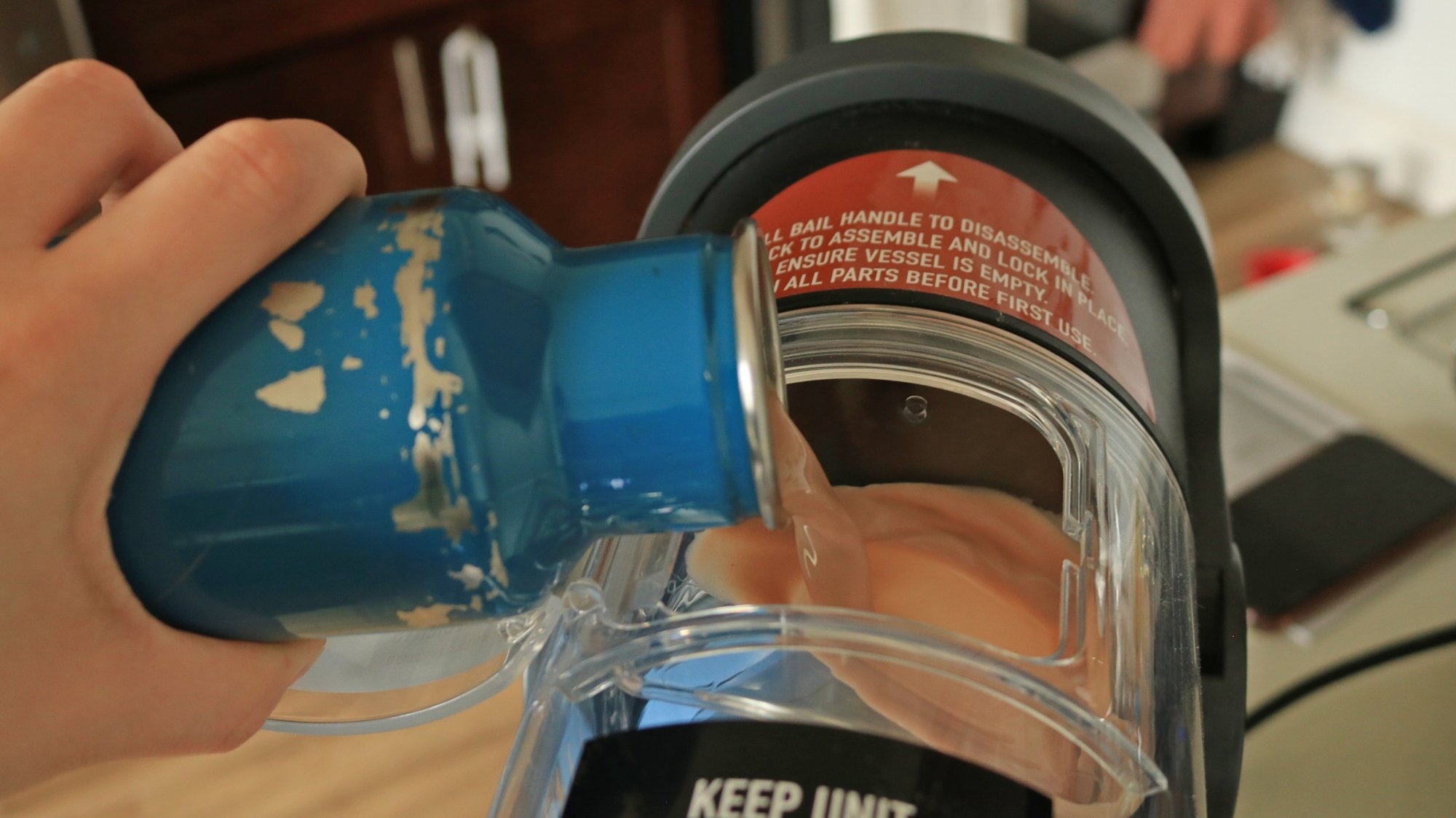
A person pouring a chocolate mixture into the Ninja Slushi vessel.

Credit: Allie Chanthorn Reinmann

The fun part is almost here! Open the hatch on the top of the main clear container. Pour the mixture in, all in one go. Depending on how your Ninja Slushi is situated on the countertop, this might be a little hard to do gracefully. I recommend using a pitcher or a bottle—any container with a somewhat narrow pour spout—for more precision. 

3. Power up

The panel of the Ninja Slushi.

Credit: Allie Chanthorn Reinmann

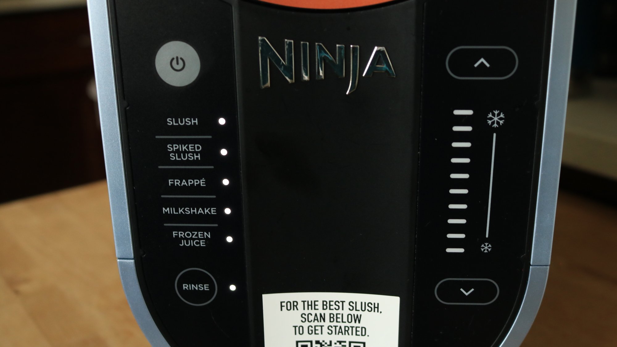
Click the power button on the control panel. All of the features should light up. On the left side, you’ll see the presets. Select the one that best matches the mixture you made: a regular soda slushie would be the “Slush” preset, an alcoholic slushie would be “Spiked Slush,” a coffee frappé would be the “Frappé” setting, and so on for milkshakes and frozen juices. This time, I decided to make a chocolate milkshake. Press the button you need and the right side panel should automatically light up with the number of bars that indicate the temperature. The machine should start churning, so all you have to do is wait. 

Note that this is the stage where the Ninja Slushi will alert you if you did not add enough sugar or if there’s a problem with the alcohol content. You know how to add more sugar, and more alcohol can go directly in the machine if needed—but if you added too much alcohol to start, you need to fix that by pouring in some water to dilute the mixture. If the tank is already at the Max Fill line, dispense some mixture before adding water to dilute it. 

4. Dispense and adjust consistency 

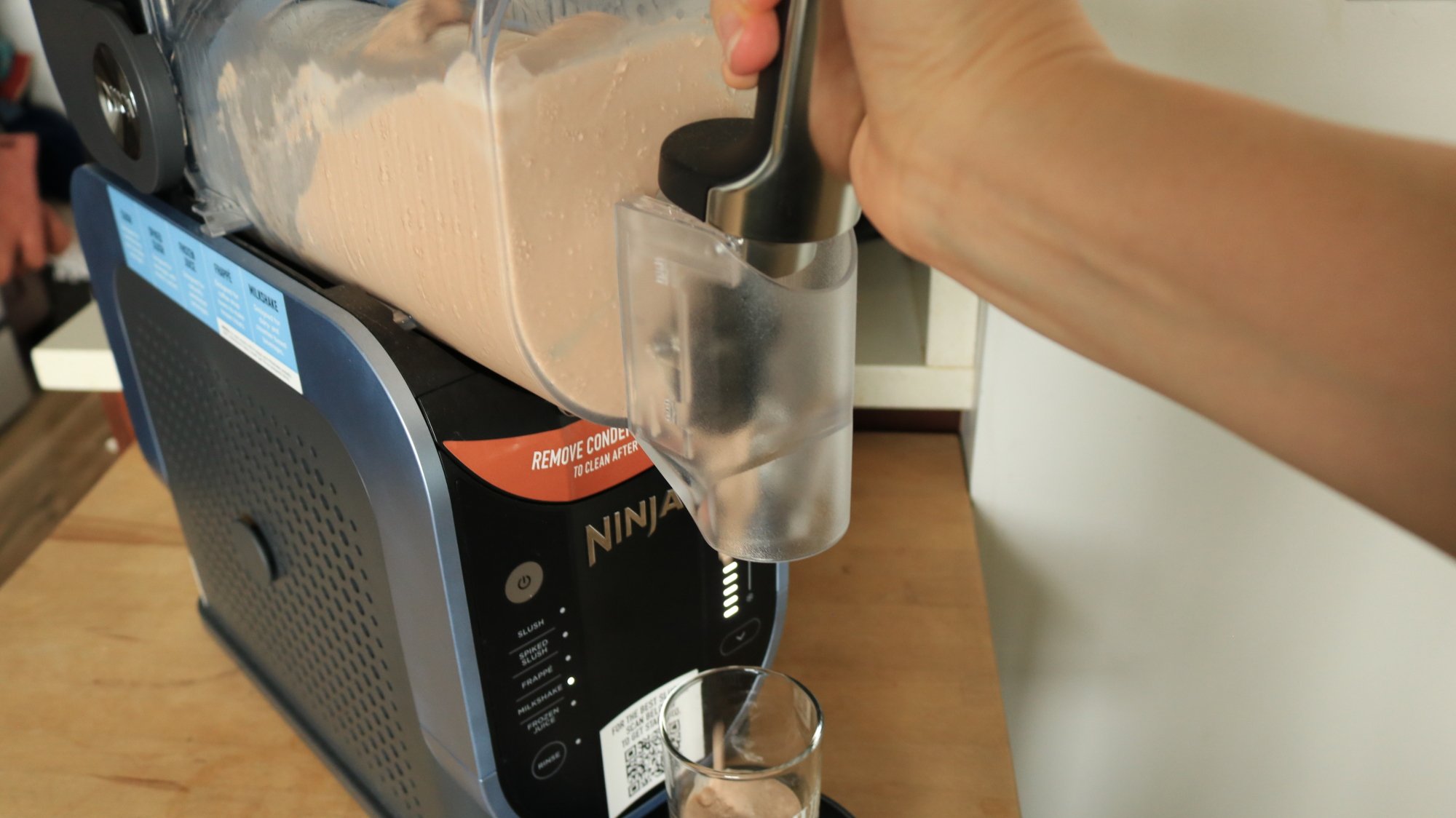
A person dispensing milkshake out of the Ninja Slushi.

Credit: Allie Chanthorn Reinmann

Once the Slushi has finished the setting cycle, it’ll play you a little ditty to signal it’s ready, but the auger will keep spinning. Grab a glass and hold it under the spout. Pull the handle toward you and hold it to dispense your slushie. The handle doesn’t have a locking mechanism while dispensing, so you have to keep pressure on it or it’ll spring shut. 

If you’re happy with your slushie’s consistency, hooray! If you aren’t, you can make it thicker or thinner by manually pressing the up arrow (for a thicker, colder slushie) or the down arrow (for a warmer, more liquid-y slushie). The machine will alert you when the new temperature has been reached.

5. Clean everything thoroughly

After the party is over, you’ll need to clean up your Ninja Slushi. If there is still slushie left in the container, dispense it all into a bowl or container. You have to do this with the preset running because it’ll push the mixture down and out of the spout. Discard it or save it to slush another day. 

Turn off the preset and select the rinse button. Have a big container handy—I use a 4-quart pot as my helper of choice. Pour hot water all the way up to the Max Fill line, then put the pot under the spout and slowly dispense all of the water. Liquid comes out way faster than slush, so only pull the dispensing handle toward you maybe 30%.

Once all of the water is out, stop the rinse cycle by pressing the rinse button again, then press the power button to turn the machine off. Unplug it and disassemble the same parts you washed earlier. I hand wash them with warm soapy water, but if you have a dishwasher, the directions say you can toss all the parts in there. Wipe down the evaporator with a warm, damp cloth. Dry everything off before assembling the pieces again for storage, or to make your next slushie.

Intel Arc B580 GPU With 24GB VRAM Spotted, Dual GPU Model With 48GB Inbound?

Intel Arc B580 GPU With 24GB VRAM Spotted, Dual GPU Model With 48GB Inbound?
If you asked us what we would want out of an upgraded Arc B-series (“Battlemage”) GPU, it probably wouldn’t have been “more video RAM,” but that’s because we’re primarily gamers, not primarily AI researchers. The B580’s 12GB of video RAM is more than sufficient for its needs as an entry-level gaming GPU, yet it’s quite clear now that the persistent

One of the tech industry’s sources of carbon credits is in conflict with Kenyan herders

A conservation program in Kenya that tech companies like Netflix and Meta rely on for carbon credits is in conflict with local herders, according to a report from The Wall Street Journal. The issue led to the program run by The Northern Kenya Rangelands Carbon Project to be put on hold, and could ultimately invalidate credits the organization has already sold.

This specific carbon capture program uses grass spread across 4.7 million acres of land communally owned by groups like the Maasai, to trap carbon in the soil. The project gets to use the land, and in exchange, the herders get a portion of the revenue from carbon credit sales. The issue that’s put the whole program at risk is a conflict over the herders’ farming practices. The local agricultural community has used the same grazing techniques for generations without issue, but the Northern Kenya Rangelands Carbon Project wants them to “rotate livestock grazing so grasses can recover and lock more carbon into the soil,” The Wall Street Journal writes. Some herders frustrated with the rules have gone as far as to claim that they were misled when they originally agreed to participate in the conservation program.

Many tech companies rely on purchasing carbon credits to help offset the negative environmental impacts of rapid technological development. You don’t get to run servers streaming movies or training AI models 24 hours a day without consuming a lot of electricity and water. Carbon offset projects plant trees or run agricultural programs like the one in Kenya to pull carbon from the atmosphere, selling credits to companies to absolve them of their sins. 

Clearly, these carbon projects haven’t always been actually beneficial for the people who live on the land they impact. The Wall Street Journal report is worth a read and gets into what the fallout of all of this could be, but at the very least, tech companies’ branding themselves as “carbon neutral” seems like its going to get trickier.

This article originally appeared on Engadget at https://www.engadget.com/big-tech/one-of-the-tech-industrys-sources-of-carbon-credits-is-in-conflict-with-kenyan-herders-201056081.html?src=rss

Kia debuts the PV5 WAV, a wheelchair-ready electric van

Kia has introduced a wheelchair-accessible vehicle (WAV) iteration of its first electric van. The PV5 WAV offers several accessibility features, such as a side-entry system so a wheelchair user can board the van from the sidewalk, and a quick-use entry ramp rated for 300kg (661 lbs). It’s equipped with a tip-up seat in the third row so other riders can assist a wheelchair passenger from the side. The PV5 WAV also has a wheelchair-specific belt fastening system.

The brand collaborated with Motability Operations on the debut of the PV5 WAV. Motability Operations is a long-term partner of the UK’s vehicle leasing plan that helps people with disabilities to have an accessible mode of transportation.

Promo image of the Kia PV5 WAV (wheelchair accessible vehicle)
Kia

“By integrating cutting-edge Platform Beyond Vehicle (PBV) technology with thoughtful design, we are paving the way for a future where everyone can enjoy the benefits of sustainable mobility, and our partnership with Motability Operations is a testament to our commitment to making this vision a reality,” Sangdae Kim, executive vice president and head of Kia’s PBV Division, said. The PBV tech has been the foundation for a few of Kia’s new vehicle announcements over the past year, including at CES 2024.

The standard model of the PV5, Kia’s first electric van, recently began pre-orders in the UK. Kia hasn’t shared pricing information yet about the WAV model, but the non-WAV version retails starting at £32,995 (about $44,000).

This article originally appeared on Engadget at https://www.engadget.com/transportation/evs/kia-debuts-the-pv5-wav-a-wheelchair-ready-electric-van-200554987.html?src=rss

Six Strategies to ‘Tariff-Proof’ Your Home Renovation Project

If you’re like most people, you’re getting a real-time crash course in tariffs, imports, and exports these days. Realizing that tariffs are going to increase costs for just about everything is just the beginning: The next phase of acceptance is realizing what “everything” means. We import so much of the stuff we use in our daily lives that it’s going to be impossible to avoid what is essentially a new tax on stuff.

That means that any plans you have to renovate, remodel, or repair your home are going to be a lot more expensive. How much more? Some experts suggest a blanket 25% increase in your budget, driven by an estimated increase in building materials costs of about $7,500 to $10,000 per house. That’s a lot of money no matter how big or modest your renovation plans are, and might make you think twice about your project. But there are strategies you can use to blunt the impact of those tariffs if you plan your home project carefully.

DIY thoughtfully

Your first step is to consider where you can offset those extra costs by doing some of the work yourself. Demolition is often an easy way to shave a bit of money from a renovation budget, and if you have any other applicable DIY skills (or the willingness to learn), you can offset extra costs by doing some tiling, painting, or installations yourself. Just be thoughtful about it—you won’t save anything if you screw up part of your renovation and have to pay someone to re-do the whole project.

Pad the budget

The worst outcome of a renovation or remodeling project isn’t extra costs, necessarily—it’s not being able to finish the job because you run out of money and finding yourself doomed to live in a half-finished house. To avoid that fate, review your renovation budget—which should already include some padding against unexpected costs—and add an additional “pad” to cover potential tariffs.

Since everything about these tariffs changes more or less constantly, you can’t accurately predict each and every impact. Assuming an additional blanket cost of about 20% on top of your current estimate is probably a pretty safe course.

Buy materials now

When, exactly, prices will start jumping due to tariffs is difficult to quantify; it depends on how large a supply remains, the specific country a material is sourced from, and when the last non-tariffed shipments arrived. But if you have plans for a renovation in the near future, it might be smart to buy your materials now, even if you’re not ready to engage contractors for a while. If you know you want imported marble tile, for example, chances are they’re as cheap right now as they’re going to be for a very long time. And if your kitchen reno involves all-new appliances, you’ll almost certainly pay less today than you will in a few weeks or months.

Go domestic

Of course, you also ask yourself if you need imported materials at all. While the U.S. isn’t a manufacturing powerhouse, you can identify domestic options for a wide range of renovation and remodeling materials. Costs still may go up if those companies need to import goods to produce those made-in-the-U.S. products, but this strategy may help mitigate costs. A few examples include:

  • Chasing Paper offers made-in-the-U.S. peel-and-stick tile and wallpaper.

  • Mohawk flooring offers laminate flooring and other flooring products that are free from tariffs.

  • Copeland Furniture manufactures collections that are mostly made in the U.S. (like most furniture makers, they import some machined parts, like nuts and bolts), so tariff impacts will be minimal.

  • Barker Cabinets makes kitchen cabinetry right here in the U.S. using domestic lumber.

A little research and consultation with your contractors can identify many domestic alternatives for materials that can help offset or eliminate tariff costs.

Work the contract

When you hire a general contractor or a subcontractor, there’s always a negotiation (or there should be). That means you might be able to claw back some of the extra tariff-related costs by pursuing some strategies in the renovation contract:

  • Price locks. If you’re relying on your contractor to supply the necessary materials for your project, ask to insert price locks in the contract. This is language that freezes the cost of those materials for a period of time (typically a few months). This at least insulates you from a sharp uptick in costs due to sudden shifts in trade negotiations and tariff rates.

  • Guaranteed Maximum Price (“GMP”). You can also ask to have the maximum cost of the project written into the contract. A GMP is the most the contractor will be able to collect from you, no matter what else might change in terms of their materials costs (or any other cost). It usually includes some padding to cover reasonable overages and their fees, but it can be a useful defense against uncertainty when it comes to the cost of the project.

  • Shared savings clauses. You can also suggest that you and the contractor “share savings,” which means that if they identify lower-cost options for materials, labor, or any other aspect of the job, you agree to pay them a percentage of the savings total. This incentivizes the contractor to evade tariffs, seek out domestically sourced alternatives, or find materials already sitting in a warehouse somewhere that don’t need to be imported new.

Wait for the off season

Another way to offset tariff increases in a reno project is to wait. Many renovation projects have a season, and contractors often go through skinny periods when business drops off. They’re often motivated to offer discounts or work with smaller budgets during these periods, so if you’re willing to endure some extra logistical problems (like having work done during the winter months), you can make up at least some of the difference in terms of tariff costs. Some examples of renovation “seasons” include:

  • Most kitchen, bathroom, and landscaping projects are done in the spring, as are most roofing and HVAC projects. These contractors may be more amenable to discounts in the fall or winter.

  • Window replacements and hardscaping projects like patios are usually done in the summer.

  • Exterior paint is typically done in the fall, when temperatures are cooler and humidity is lower, but you can have your house painted as long as temperatures are above 35 degrees, so painting companies may be motivated to offer discounted work in different seasons.

  • Many flooring installers run promotions during the winter, when business is slower.

If you buy your materials now to save some money and then start the project in the off-season, you can maximize your savings.

If Congress actually cancels the SLS rocket, what happens next?

The White House Office of Management and Budget dropped its “skinny” budget proposal for the federal government earlier this month, and the headline news for the US space program was the cancellation of three major programs: the Space Launch System rocket, Orion spacecraft, and Lunar Gateway.

Opinions across the space community vary widely about the utility of these programs—one friend in the industry predicted a future without them to be so dire that Artemis III would be the last US human spaceflight of our lifetimes. But there can be no question that if such changes are made they would mark the most radical remaking of NASA in two decades.

This report, based on interviews with multiple sources inside and out of the Trump administration, seeks to explain what the White House is trying to do with Moon and Mars exploration, what this means for NASA and US spaceflight, and whether it could succeed.

Read full article

Comments

I Created These Spreadsheets to Help Me Play Video Games (and Yes, This Is a Cry For Help)

Hades II introduces a new mechanic called Forget-Me-Not, which allows players to pin recipes they don’t have enough crafting reagents for. While they’re out in the world, the path to those resources will be highlighted, making it easier to keep track of what you need. I love this feature, in no small part because I’ve been making my own version of it for other games for years. It’s just one of the many ways I use spreadsheets to improve my gaming.

To be clear, I am not recommending that you follow in my footsteps and create a spreadsheet for every game you play. I am deeply unwell, the world is on fire, and creating little charts and tables is how I exert some semblance of control over a chaotic world. Also, not every game needs a spreadsheet.

For some games, though, it’s just more helpful to have your own goal tracker. Especially in sandbox games, where the quest markers are only the start of what you can do. For my purposes, I’ll either use a typical Google Sheet, or if I’m feeling real spicy, I’ll branch out to something like Notion for some more flexible tools. Here are just a few examples of what I do.

Tracking Tears of the Kingdom armor upgrades

There are so many armor sets in Tears of the Kingdom, and tracking down every piece is super rewarding both in terms of exploration and the powers you get from different sets. What’s less rewarding is upgrading the ones you already have. You need to visit Great Fairies with the right amount of ingredients, some of which are super rare or only drop from specific enemies. Some of which you might’ve otherwise walked right past if you didn’t know you needed them. (Looking at you, Lizalfos tails.) 

That’s why I made this armor upgrade tracker. I gave myself sections to mark off which sets I’m most interested in collecting, how many pieces I still have left to claim, what upgrade level each of them is currently at, and whether there’s a set bonus I haven’t unlocked yet. Most of this info is technically visible in the UI, but this way I don’t have to dig through menus to see whether I’ve finished upgrades on the Froggy armor before I go collect a bunch of sticky lizards.

I also gave myself space to write down what ingredients I need for an upgrade, which is low-key the most helpful part for me. Almost everything in Tears of the Kingdom is used to upgrade some armor set or another, but I don’t always remember which ones I care about. And the only way in-game to see what ingredients are needed for an upgrade are to visit the Great Fairy directly.

This saved me tons of wasted effort because, when I’m out adventuring, I can quickly look at my notes to see whether I still need a particular item when I come across it. Not only is this handy as reference, but it saves me from having to go on a farming run later for the five Thunderwing butterflies I walked right past hours earlier.

Running an outpost empire in Starfield

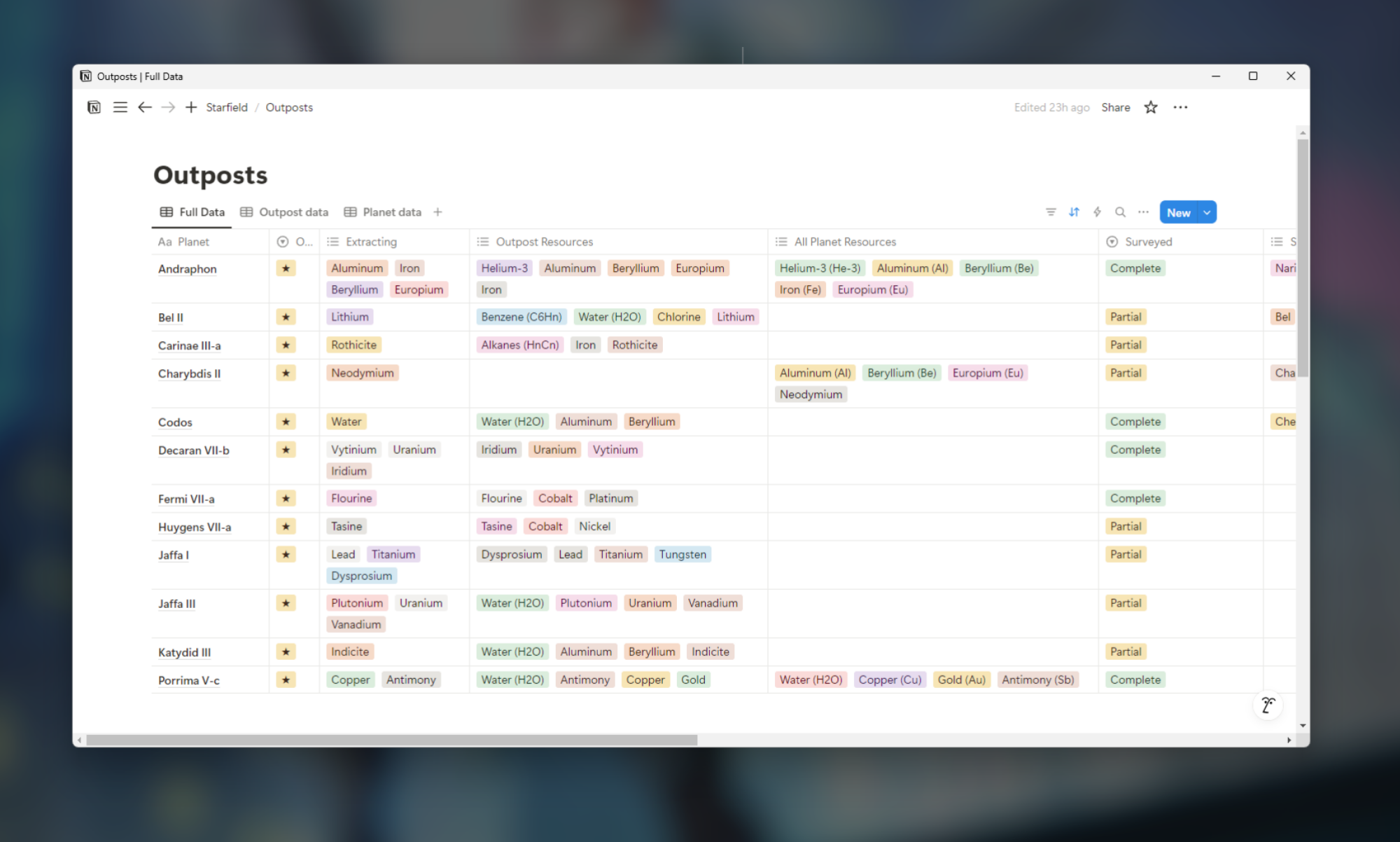
'Starfield' Notion spreadsheet

Credit: Eric Ravenscraft

I have my complaints about Starfield, but that didn’t stop me from spending dozens of hours building outposts to farm as many resources as possible. Is there a point to this? Not really. Most resources you need in Starfield, you can either buy or farm easily. But I like building my own mini-economies. The only trouble is, the game isn’t built to be the overseer of dozens of outposts.

Enter my Notion table. For this one, I gave myself at-a-glance reference points for the resources each planet has, which of those resources are available at my outpost, and which of those I’m currently harvesting. Since you get a bonus when you’ve fully surveyed a planet, I’ve also marked whether I’ve completed that planet’s survey. (Note: I wasn’t able to easily make this into a template, so you’ll have to make your own version from scratch. This page from Notion will help you understand the basics, but there are plenty of other YouTube tutorials to check out if you need more guidance.)

Granted, this is my own personal Sisyphean boulder, since the only reason to spend this much effort organizing Starfield outposts is for the joy (?) of outpost organizing. However, I’ve done similar things for games like Stardew Valley, which are a bit more objective-oriented.

I used Notion for this one because I liked its approach to databases a little better than Google Sheets. You can create a full database with entries for all the data you need, but then create alternate views that only focus on some of the data you’ve created. For example, I also tracked what flora and fauna grew on each planet, but since I didn’t need that while managing my outposts, I decided to create a view that didn’t include it.

Quantifying my time wasted in Overwatch 2

Of all the spreadsheets I’ve made for the games I play, few have brought me as much pain as this one. Overwatch 2 switched to a battle pass system, with rewards that will disappear if you don’t claim them by the end of the season. I play a lot of this game already, but I wanted to know just how much time it would take to complete certain rewards.

So, I made myself a little calculator. I started by tracking the average amount of time it took to complete a game and how much XP I got for each game. Then I gave myself a few boxes that calculate how much time it would take to reach a reward tier, based on how much XP I’d earned so far. I got it down to a point where I only had to fill in three blocks (highlighted in blue in the sheet) to see how much more time I was planning to waste in a game for a cosmetic reward I wouldn’t even use.

Now, I don’t need to be told to play Overwatch 2. I love playing it with my friends, and I’ll gravitate to it regardless of how much it mistreats me. The real value here is that, sometimes, this spreadsheet discourages me from playing. If the game says “You’re just 50,000 XP away from getting a reward!” it might seem like a good idea. The game wants you to keep playing after all. Instead, my spreadsheet says “You will have to play 41 more hours of this game to reach that level. So I sigh and close the game.

This has actually helped me kick some of that “Just one more game” habit that’s so easy to fall into. Every online game these days has a litany of rewards and points and blips and bloops designed to give you just a little dopamine every time you decide to keep playing. My calculator tool wasn’t designed to save me time, but it did end up being more honest about it than Blizzard would ever be.

Other spreadsheet ideas

These are just a few of the many examples I’ve made over the years. I’ve made sheets that calculate how much my Stardew Valley crops will yield over time, taking the guesswork out of buying from Pierre’s store. (I’m also far from the first with this idea.) I’ve also made sheets similar to my Tears of the Kingdom tracker for upgrades in games from Skyrim to Horizon Forbidden West.

Even if you’re not into making your own, there’s a chance some enterprising gamer out there has made arcane spreadsheets for things like how much an armor buff affects your favorite hero. Any time there’s some math I want to do that the game doesn’t do for me, or resource requirements I’m sick of Googling over and over, I’ll turn to my trusty spreadsheets—and now you can (should?) too.

Doom: The Dark Ages is surprisingly playable on the Steam Deck

While working on our review of Doom: The Dark Ages last week, I was unable to test the game on the Steam Deck due to a bug that prevented it from launching on SteamOS. I didn’t consider this much of a loss at the time, since I figured the Deck’s 3-year-old portable hardware was rated way below the minimum PC specs for the game, which call for ray tracing-capable graphics cards at a minimum.

Over the weekend, though, Valve released a preview build of a new version of SteamOS that allows Doom: The Dark Ages to actually launch on the Steam Deck. And after a bit of testing, I found the game is surprisingly playable on Valve’s portable hardware, provided you’re prepared to turn down the graphics settings.

With all the graphical quality sliders set to “Low” (and FSR upscaling set to “Performance”), I was able to run Doom: The Dark Ages at the system’s native 1280×800 resolution and a reasonably steady 30 to 40 fps.

Read full article

Comments

YouTube will exclusively stream an NFL game for free

YouTube will be streaming an exclusive NFL game in its entirety for free worldwide for the first time ever. After becoming the official home of NFL Sunday Ticket in 2023, YouTube has been pushing to expand its reach in the high-stakes, multibillion-dollar world of NFL coverage and broadcast rights. 

The Google-owned streaming company has secured the exclusive rights to broadcast one of the NFL’s opening week games on Friday September 5 live from Brazil. The São Paulo spectacle will take place the day after the Thursday night NFL KickOff game between the Eagles and the Cowboys. The 2025 NFL regular season will feature seven international games, a record for the league.

In an NFL press release, YouTube’s chief business officer Mary Ellen Choe said, “Streaming the Friday night game to fans for free around the world will mark YouTube’s first time as a live NFL broadcaster – and we’ll do it in a way that only YouTube can, with an interactive viewing experience and creators right at the center of the experience.”

Last year, fellow streaming giant Netflix streamed its first live NFL games on Christmas Day as part of a three-year deal with the league, though Netflix doesn’t have a NFL specific product to sell its customers like YouTube has with NFL Sunday Ticket.

In the press release announcing YouTube’s coverage of Week 1 from Brazil, Mary Ellen Choe discussed the reach of NFL games on YouTube, saying, “Last year, people spent over 350 million hours watching official NFL content on YouTube, so it’s both fitting and thrilling to continue to build our relationship with our partners at the NFL.”

This expanded partnership comes against the backdrop of other team-ups between YouTube and the NFL aside from NFL Sunday Ticket, namely a multi-year deal for the annual Super Bowl Flag Football game as well as additional international flag football games.

The exact cost for the broadcast rights to the Brazil game is not known at this time, though it’s known that YouTube is paying over $2 billion per year over a seven-year deal for NFL Sunday Ticket.

This article originally appeared on Engadget at https://www.engadget.com/entertainment/youtube/youtube-will-exclusively-stream-an-nfl-game-for-free-191519460.html?src=rss

USENIX Sunsets Annual Technical Conference After 30 Years

New submitter Synonymous Homonym writes: This year’s USENIX ATC will be the last, but other USENIX conferences will keep happening.Since USENIX’s inception in 1975, it has been a key gathering place for innovators in the advanced computing systems community. The early days of meetings evolved into the two annual conferences, the USENIX Summer and Winter Conferences, which in 1995 merged into the single Annual Technical Conference that has continued to evolve and serve thousands of our constituents for 30 years.USENIX recognizes the pivotal role that USENIX ATC has played in the shaping of the Association itself as well as the lives and careers of its many attendees and members. We also realize that change is inevitable, and all good things must come to an end:
The last ATC will include both a celebration of USENIX’s 50th anniversary on the evening of Monday, July 7, and a tribute to USENIX ATC on the evening of Tuesday, July 8.


Read more of this story at Slashdot.

iOS Is About to Get a Lot More Accessible

Is your iPhone, iPad, or Mac a little hard to use? Lucky for you, Apple has announced key accessibility features coming to all its devices later this year. These include Accessibility Reader, which makes small fonts easier to read, and Vehicle Motion Cues, which prevent motion sickness while using Apple devices in vehicles. If some of these sound familiar, it’s because they may already be on one or two Apple devices, but are now set to come to others as well. While the company’s already tipped its hat as to what’s in the works, expect to hear more details during WWDC 2025, scheduled from June 9 to 13. That’s where Apple usually unveils all of its annual operating system updates and sometimes, even shows off new hardware.

In the meantime, here are all the new accessibility features we currently know are coming to Apple devices later this year:

Accessibility Reader makes text easier to read

Accessibility Reader

Credit: Apple

Lots of people find default text sizes or fonts difficult. Accessibility Reader is a new feature designed to help with that. It allows you to customize text on your Apple device to make it easier to read. You can change the font, color, spacing, and have your Apple device read out the text for you. You can think of it as reader mode for text in any file (or even in the real world, which I’ll touch on shortly), or as improved text-to-speech. This is because Accessibility Reader can be launched from any app, according to Apple. It can also be paired with the Magnifier app on your Apple devices, which means that you can zoom into text in the real world and use this feature to read it more easily. This feature will be available on the iPhone, iPad, Mac, and Apple Vision Pro.

Magnifier comes to the Mac

Magnifier on Mac

Credit: Apple

Your iPhone ships with a built-in magnifying glass, which is the Magnifier app. This is an important accessibility aid for many people who have low vision, and now Apple says it’s coming to the Mac. On the Mac, you’ll be able to connect Magnifier to external cameras as well, including your iPhone if you’re using it as a webcam via Continuity Camera. You’ll be able to tweak brightness, contrast, color filters, and perspective to make it easier to see things with Magnifier for Mac, according to Apple. 

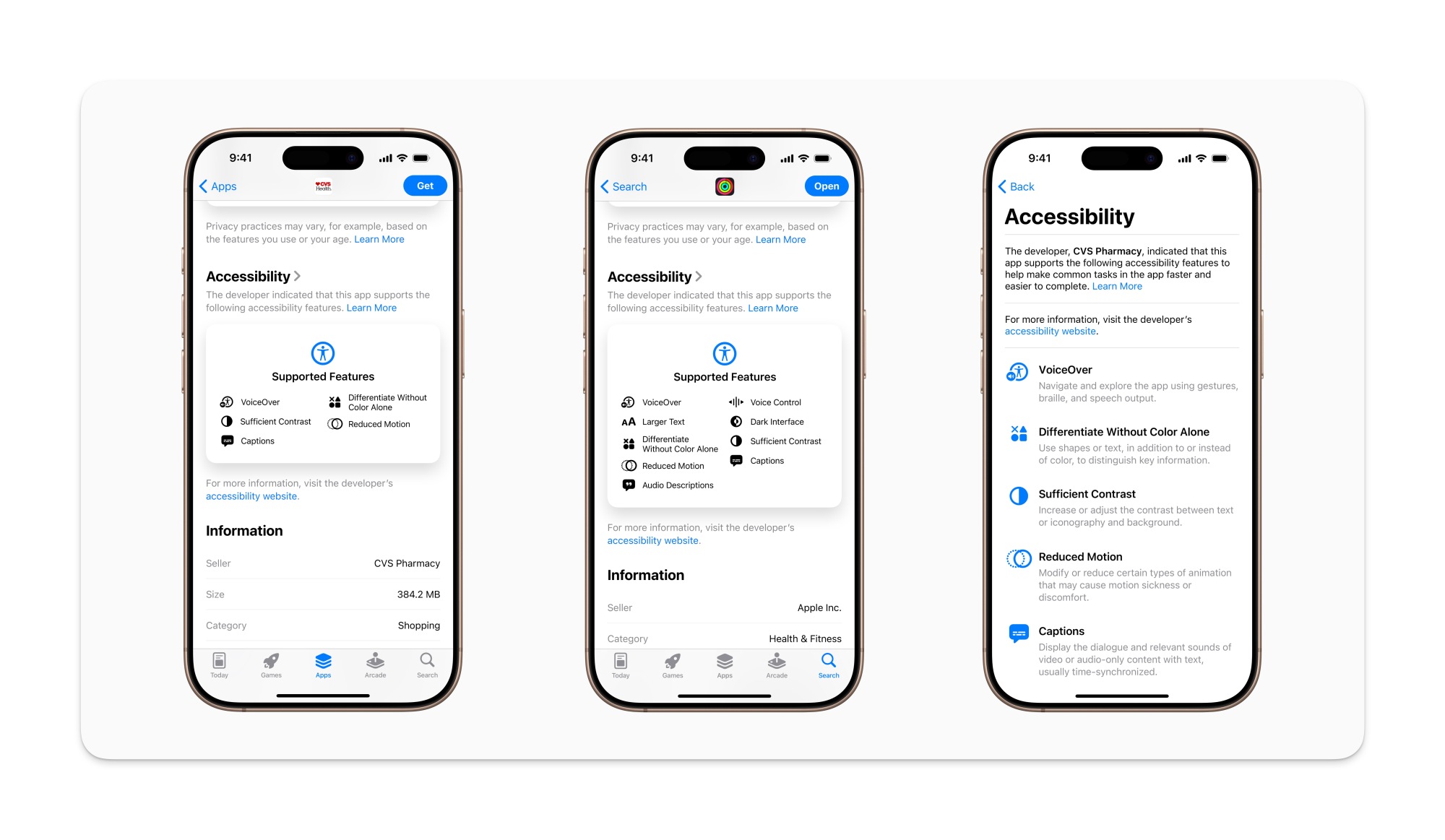
Accessibility nutrition labels are coming to the App Store

Accessibility nutrition labels on the App Store in iOS 19.

Credit: Apple

The App Store added ‘privacy nutrition labels‘ to app listings a few years ago, which helps you quickly see if apps are collecting your data. Now, the App Store is adding accessibility nutrition labels to help you check if an app supports the accessibility features you need. Apple says these labels will acknowledge whether an app supports VoiceOver, Voice Control, Larger Text, Sufficient Contrast, Reduced Motion, captions, and more. 

Still, I really wish Apple would add better search filters to the App Store. I’d love to filter out apps that collect data and lack support for specific accessibility features, and there’s currently no real way to do that.

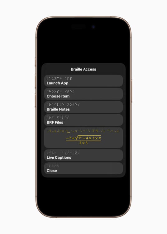
Improved Braille support on Apple devices

Braile access on iPhone

Credit: Apple

Apple also says that it’s adding Braille Access to your iPhone, iPad, Mac, and Apple Vision Pro. This feature adds a braille note taker to your devices, and can even perform calculations using Nemeth Braille (which is often used in math and science classrooms). Braille Access can also open BRF (Braille Ready Format) files, which will allow people to access books and files created on braille note taking devices. 

Live Captions are now on the Apple Watch

Live captions Apple Watch

Credit: Apple

Live Listen is an Apple feature that makes things easier to hear for people who are deaf or hard of hearing. Apple says Live Listen controls will soon be added to your Apple Watch as well, and the device will be able to show real-time Live Captions. This works by turning your iPhone into a remote mic that streams directly to made-for-iPhone hearing aids, AirPods, or Beats headphones, and when this is active, you’ll be able to view captions directly on a paired Apple Watch, according to Apple.

The watch can start or end Live Listen sessions, which will allow you to place the iPhone near the person who’s speaking and follow the conversation from a short distance away on your Apple Watch. This could be great for learning in a classroom and other similar situations. 

Vehicle Motion Cues comes to the Mac

Vehicle motion cues on Mac

Credit: Apple

Ever since they launched last year on the iPhone, Vehicle Motion Cues have been indispensable for me. The feature works by displaying moving dots on the screen that correspond to the direction of a vehicle’s motion, and it’s now coming to the Mac, Apple says.

I’ve always suffered from motion sickness, which makes it hard for me to view screens while I’m in moving vehicles. Even if I’m otherwise fine in a car or a bus, I start to feel very nauseous if I look at a screen, read a book, or try anything that requires me to focus on a fixed object. Since Apple launched Vehicle Motion Cues last year, I’ve finally been able to use my iPhone when I’m a passenger in vehicles. If this feature works as well on the Mac, I’m excited to use it to watch videos when I’m riding in a car. The company also said that it’s planning to allow you more control over how these dots are displayed on your screen.

Improved accessibility features on the Vision Pro

Vision Pro Enhanced View

Credit: Apple

Apple Vision Pro is set to get a new Enhanced View, which will allow you to magnify everything that’s in view via the main camera on the device. Apple says the Live Recognition feature will use on-device machine learning to describe surroundings, find objects, read documents, and more. The company also plans to enable a new API to allow some apps to access the Vision Pro’s main camera, which will help developers create apps that make the most of these accessibility features.

Other important updates

Apple also revealed a bunch of other, smaller accessibility related features. Here are a few of my favorites:

  • Background Sounds, which lets you play nature sounds or dark noise, will get more customization options, a timer to stop playing after a while, and new actions for automation via Shortcuts.

  • Personal Voice, which recreates the voices of people who are losing the ability to speak, will be faster and easier to use, Apple says. The feature will be able to create a more natural sounding voice in under a minute with 10 recorded phrases, according to the company.

  • Share Accessibility Settings lets you temporarily share your accessibility tweaks with other Apple devices, such as when you’re using an iPad to place an order or borrowing a friend’s device for a bit.

You can check out the full list of accessibility updates and content on Apple’s website.

Amy Hennig’s ‘Marvel 1943: Rise of Hydra’ is delayed to 2026

The adventure game Marvel 1943: Rise of Hydra has been delayed until 2026, according to a statement by publisher Skydance Games. The title was supposed to come out sometime this year.

What’s the reason for the delay? The publisher says it’s to “add more polish,” which is never a bad thing. I’d rather a fully-finished game upon release than a buggy mess. The company does say it’ll be available in the early part of 2026, so that isn’t too long to wait. Still, it’s disappointing news for eager Marvel fans.

Marvel 1943: Rise of Hydra is a narrative-driven adventure game with four playable characters, including long-time icons like Black Panther and Captain America. As the name suggests, it’s set during World War II in occupied Paris.

It’s being developed by Amy Hennig and her new studio, which is a subsidiary of Skydance. If her name sounds familiar, that’s because she’s best known for being a creative director and writer at Naughty Dog. Hennig was the lead writer on all three Uncharted games and was creative director for the Legacy of Kain franchise. She’s got a fantastic pedigree, so this new Marvel game could be a heavy hitter.

This article originally appeared on Engadget at https://www.engadget.com/gaming/amy-hennigs-marvel-1943-rise-of-hydra-is-delayed-to-2026-185945301.html?src=rss

Google announces Material 3 Expressive, a colorful evolution of Android design

Google accidentally showed off its big Android design refresh last week, but now Material 3 Expressive is official. Google says the new interface will begin with Android OS, but it will eventually expand across the full Google app ecosystem, bringing a more lively vibe to Gmail, Google Photos, and more.

Material 3 Expressive won’t be entirely unfamiliar—it shares some basic design elements with the Material You system Google launched four years ago. Material 3 Expressive is a bolder take on the same aesthetic, featuring “springy” animations, brighter colors, and new shapes.

Material 3 Expressive

As we learned from Google’s slipup, Material 3 Expressive is the result of numerous user studies, which included more than 18,000 participants. Google explored how people parse information on their phone, finding design themes that supposedly support quicker and easier interactions. Often, that seems to result in making certain UI elements larger and easier to spot. Google claims people can find these important buttons four times faster than they can with older Material You interfaces.

Read full article

Comments