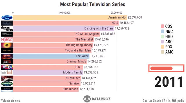
This is an ever-changing bar graph visualization of the most watched television series from 1951 to 2019. I’d be lying if I said it wasn’t depressing to watch, and not just because most of the modern shows suck, but because I knew I didn’t have anything better to do with my time than watch all twelve minutes. “It’s five o’clock somewhere.” It’s eight o’clock somewhere too. “What do you mean?” I’m already drunk, let’s order pizza.
Keep going for the video.
Source: Geekologie – Visualization Of The Most Watched Television Series From 1951 – 2019