
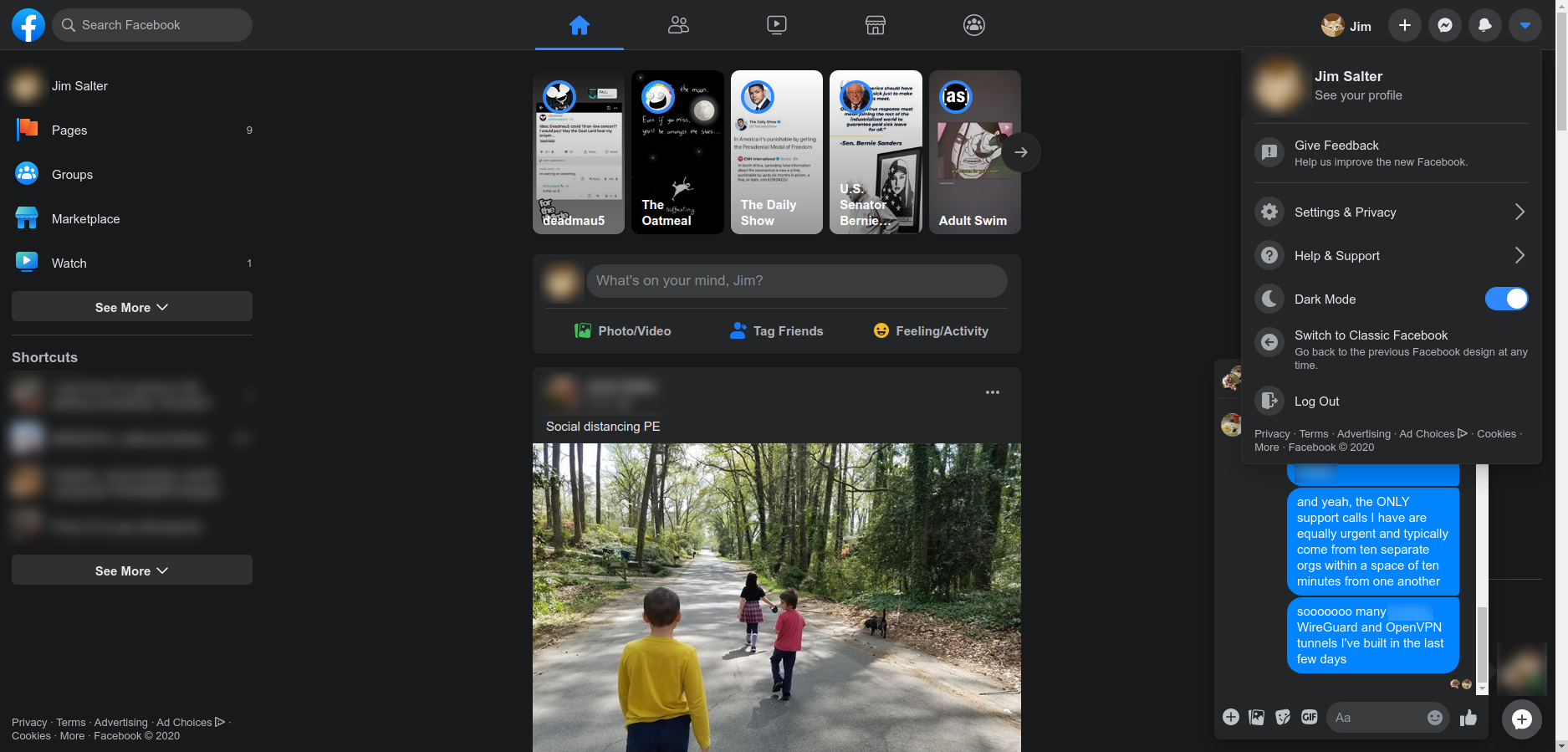
Enlarge / The new design does at least include a dark mode. I generally prefer bright layouts, but if you have a bad habit of Facebooking in bed late at night, this is less likely to prevent sleepiness. (credit: Jim Salter)
Sometime last night, Facebook’s new design layout rolled out to my personal account. It assured me that I could switch back if I didn’t like it, so I immediately tried it out. I just as immediately switched it off and never looked back. At least, I never looked back until this afternoon, when the powers that be at Ars said—and I quote—”feel free to hate review it, if you want.”
I am a professional if nothing else, so this is not a hate review. But I must admit it’s a “visceral dislike” review, and perhaps some readers will appreciate—or at least not mind—the things that turn me off so strongly about the new layout.
If you like landscape browsing on a smartphone, you’ll like the new Facebook
-
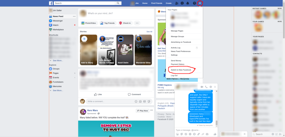
This is the current “old” Facebook design, which has been in place largely unchanged for a few years now. It’s reasonably information-dense, and—apart from the giant Story header—usually fits several posts per page.
Personally identifying information (and the odd profanity) are blurred out. [credit:
Jim Salter ]
I do the majority of my Facebook browsing on a desktop PC. A serious desktop PC, for serious people, with dual 24″ monitors in 1080P. I strongly dislike layouts that present me with less information and waste a ton of real estate, and Facebook’s new layout does exactly that, in spades.
Read 8 remaining paragraphs | Comments
Source: Ars Technica – Facebook’s new design turns your PC into an enormous phone